Avoid people confusing pagename with document title
Problem
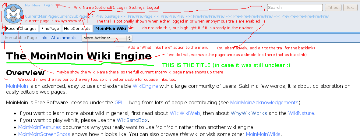
Currently we often have the problem that people confuse the page name shown in the top navigation area of modern(ized) theme with the document title.
Maybe comparing it to a document file on your local disk helps:
local file |
path and filename |
title is within the document |
wiki page |
page / subpage name |
title is within the wiki page |
Common word processors usually show the path/filename either in a rather small font in the window title, or somewhere at the bottom below the document. But modern(ized) theme shows the page / subpage name in a big font, so people think that that is intended as the document title. Well, it is not, they should use e.g. some h1 headline for the title (within their document content!).
Ideas for solving

Discussion
If we move the navibar on top we should check how it looks like with the private links. I think it looks bad because the logo and login navigation is moved down.
I think we should move the interwikiname into the #header left of Login etc.
We need a button or something else for reloading the current page without using the browsers reload function. Otherwise we can't remove highligthing by search or switch from AttachFile or some other virtual page actions back to the text.
 This is why I thought about just simple linking the page name (so you can use it for reload), not linking it to backlinks search.
Also I think we have lots of space right of the More Action menue. We can think about moving some of the actions into the theme. Then the menue does not need a scrollbar for the others.
The trail history can be moved into a right floating object similiar to header of gugiel. May be below the search box is a nice place. May be we want to extend it to 10 members.
