Description
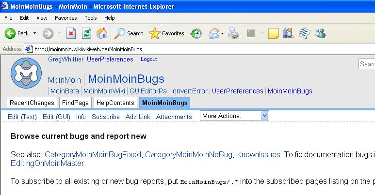
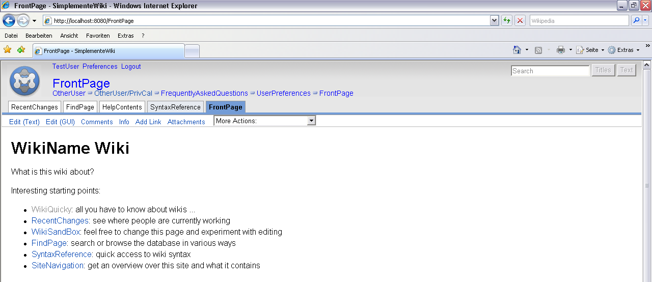
The little ">>" characters are missing from the page trail and the "/" is missing between page and subpage when viewed by Internet Explorer 6.
Steps to reproduce
Browse this wiki with IE 6.
Example

Details
This wiki.
Workaround
Use firefox.
Discussion
IE CSS bug. Does not handle :before and :after.
Great plan not willing to support the IE - I love ignorant guys. You guys really did a great job with MoinMoin so far, but your arrogance (or at least some folks there) against users which only use the IE (not all companies allow the FF) is unbelivable -- Mark 2007-04-02 15:28:00
Mark, did you open a bug report for this bug on MS.com? Or can you contribute some code which does help us to workaround this bug? That bugreporting system here belongs to our bugs not to some in other software. -- ReimarBauer 2007-04-02 13:41:08
To improve the css support for IE a little bit, it would be nice to clear the left margin for the first li element in msie.css like this (not tested)
#pagetrail li:first-child, #pagelocation li:first-child {
    border-left: 0px;
}
Another workaround which would render Moin the same on all browsers is to use a background image for the list elements:
#pagetrail li, #pagelocation li {
    list-style: none;
    background: transparent url('../img/grey-bullet.png') no-repeat 0 0.3em;
    padding-left: 1em;
    display: inline;
    margin: 0;
}

#pagetrail li:first-child {
    background: transparent;
}

#pagelocation li:first-child {
    background: transparent;
}
This will render like this:

Advantage: Looks great on all browsers.
Disadvantage: Images are lost when images are disabled in the browser, images don't not zoom (at least on Firefox) like the text.
Conclusion: There is no 100% solution possible since IE has a lousy css support and Firefox a lousy zoom function. I would vote for the "look-good-and same-on-all-browsers" solution since the look is the first impression and a lasting impression of a software for most users out there. -- OliverSiemoneit 2007-04-02 18:51:17
Nice probably no need for a different rtl sign. needs to be done in all themes -- ReimarBauer 2007-04-02 19:33:08
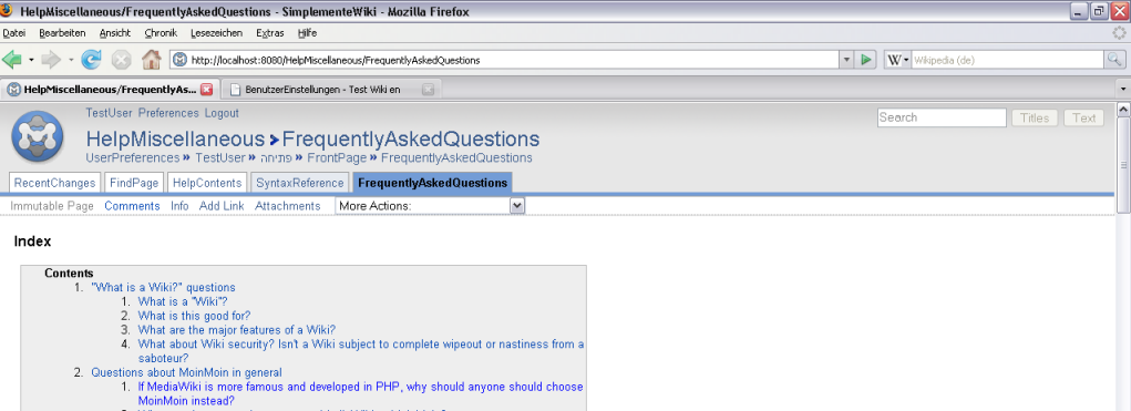
Here is a changed modern theme for Moin1.6dev which renders the same on Firefox2.0.0.3 IE7 and Opera9.10 on WinXP, integrates the above ideas and looks like this now:

-- OliverSiemoneit 2007-04-04 21:40:42
Maybe adjusting a little bit the blue color of the links in the header so that they fit better to the logo wouldn't be a bad idea.. -- OliverSiemoneit 2007-04-04 22:32:15
It should be something like >> (for ltr) and << (for rtl).
Ok. Here's an updated version...

-- OliverSiemoneit 2007-04-05 17:15:04
Ehrm, the page / subpage separator should be still a /, though.

The background image for a li-element starts always at the top of the small letters. I could not get it aligned to the top of the capital letters. So the slash looked quite silly and I had to replace it by some other seperator which could be aligned to the middle of the line heigth. I have chosen the > since the > is also the most widely used seperator for breadcrumbs navigation (see http://www.webdesignpractices.com/navigation/breadcrumb.html: only 4% of the website do you a slash as separator, but 65% a >). So I thought this might be no harm, even make it more clearer to the people that this is a breadcrumbs navi.. ![]() -- OliverSiemoneit 2007-04-05 20:41:12
-- OliverSiemoneit 2007-04-05 20:41:12
Plan
- Priority:
- Assigned to:
- Status:
