Another WikiVisualization proposal.
Contents
Introduction and justification
RecentChanges (RC) is perfectly OK for what is meant: to see what is happening in the wiki, for people that comes to it and knows about it's community dynamics.
But sometimes, you may want to explore a specific domain that is out of your usual, known field. So you may want to know, what pages are related to this concept? What is the timeline of actions around them? Who is moving these issues around? What "clusters" of pages are being generated and touched?
To facilitate this kind of exploration we need other visualization mechanisms analog to RC, but more:
- visually oriented.
- interactive.
- filterable.
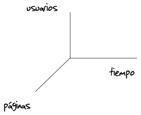
Since a wiki is a constantly adapting network of people interacting with pages (with some specific actions) along time ...

we could fold these 3 dimensions into 2, to simplify it's visualization1: time and pages, with people overlaid.
Prototype

This is a prototype -a draft- for the user interface of such a tool, called Wiki Weaving because is makes explicit and filterable, and thus, explorable:
- the courses determined by people
- taking actions with pages
- along time.
Explanation of the prototype
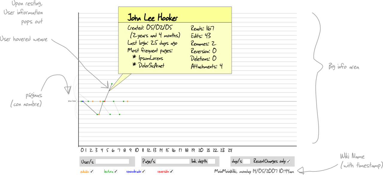
A few actions by a couple persons are shown only in this draft. Fonts and colors are not designed, just concepts, controls and interactions. Maybe the user info has more weight than ideal, but this is just a rough draft.
General ideas:
Time is seem as a horizontal line that flows from left to right (a cultural de facto standard, at least in occident).
- Pages are lines that run horizontal, parallel to time. The more there are, the less wide and dark each one. It's names are horizontal too, and expand upon hovering (so they don't distract when are not necessary but are legible when needed).
- Each action on a page is seen as a colored dot:
it's color depict which action was taken (read, write, revert, rename, delete) and
it's position marks time.
Very subtle lines join all the actions taken by each person, hence, the wiki weaving.

- Filters go down the graph and are more specific from left to right. This means that each group is joined by a AND boolean operator, although is not shown.
Specific filter details:
- Wildcards should be OK in Users and pages.
- People filter:
Users/s are people names.
- Page filter:
Page/s are page/s name/s.
Link depth (a number) could be from all resulting pages.
- Time filter:
Day/s could be fractions (0.5 would be 12 hours and the resulting timeline should reflect that).
Recent changes only could restrict appearance to only users and pages that was been touched in Day/s time frame2.
- Actions filter:
edit
read
rename
revert
delete
- Only selected action/s are visualized. By default, all.
General guidelines for visual/interaction design
- The information bearing graph occupies the most surface available.
- Controls should try not to bother.
- User input should be managed with keyboard only, if possible.
- Direct interaction with elements (page, user weave, or action) needs mouse to position but no click is necessary.
Hovering any element makes it more visible (visual weight added, like making a line thicker, a color more vivid, a point bigger, etc.).
Resting the pointer or cursor (around 1000 milliseconds) over any elements (a page line, an action, a user weave) brings up a popup window inside the graph and it's frame, with specific information (some example user info is shown in this draft).
Clicking on an element should go to that point:
- a page line, to the page.
- A user weave, the user page (if it exist).
- An action, that specific version diff with the previous.
An Enter after each field input refreshes the graph.
In the future, more projections (user/time, user/pages) could be expanded or folded to provide more insight, but this is out of this first phase.
Remaining issues
Too many, but let's start with a few... ![]()
- Where does focus should be initially? What are the defaults? Maybe the same RC user bookmark to select time frame, and "RC only" marked would make a simple and understandable start, drawing it's out-of-the-box experience from the usual RC past experiences.
- There is only time frame from the present moment with this UI draft. This makes impossible to explore time frames that are far away, since it will always compress all the view history until now. If it is considered useful to explore other -not near- time frames, the UI can be designed relatively easy, but it will add complexity and the cost/benefit ratio for the most frequent operations should be analyzed.
- Page order: there are many algorithms possible, probably each one is useful in a different scenario. Maybe doing this a filter too? A few criteria may be to order by...
- name,
- neighborhood (links between them),
- age,
- relative amount of links (more links in in at top, more links out at bottom, equal in the middle)
Which technology to use? A vector based would be ideal (with output in SVG) so as to use as much available screen spaces as possible and provide the best resolution possible with each available device (see OpenLazlo @ http://www.openlaszlo.org/.
