Discussion about the MoinMoin logo.
Contents
Contents
- What is a good logo?
- The Current Logo
- Logo rules
-
New Logo Alternatives
- The Red M
- Brick M
- Red Circle
- Double M
- Moin Balloon
- Dialog Balloon
- White Rounded Rectangle Dialog Balloon with Text
- Comics Dialog Balloon
- Dialog Balloon with Text
- ascii logo
- Parenthesis Moin
- Which?
- MoinMoin bubbles
- MoinMoin Nodes
- Another Built Moin
- M Nodes in a Circle
- Moin Cube
- Dialog Balloon Logo
- Pond MoinMoin
- Shared Writing MoinMoin
- Cube M
- Moin upside-down
- Moin Kite
- Moin Ninja
- Moin Tu
- General discussion
- Vote
What is a good logo?
See also below where Vito expresses his detailed experience about good logos.
Here is an example of a well known logo of a computer company from Cupertino USA. We can speak about different examples, but this is my favorite:
|
|
|
|
Large and fancy version embedded in the user preferences icon |
As navigation element on the the company site, and as a tiny favicon |
Engraved on apple mouse |
On a product box, see top left |
The first version of this logo has rainbow like color stripes, few years later the colors where removed, and the logo is used in variations of white and gray, depending on the media. The logo is readable even as favicon. It is simple, bold and original.
The Current Logo
|
|
|
As used on MoinMoin home page and the wiki engine |
Smaller size, possibly as a "MoinMoin Powered" badge application |
Even smaller... |
The naked guy holding the MoinMoin card is nice drawing, but its not a logo. Used in smaller size, it become hard to read and recognize. While he is a nice guy, it clear that it is not the best communication device MoinMoin could have.
What can be done?
There are several ways we can go:
- Try to make it better - draw this guy simpler and bolder, removing unneeded detail
- Drop it and design something completely different
- Do nothing, use simple text logo for smaller applications
Logo rules
Each alternative should show the logo used in:
- Site header
- Should work nicley with the default theme used here - modern
The header must contain the word MoinMoin in a bid readable type
- The height should not be more then 54 pixels (current logo height).
- Favicon
- Size must be 16x16 pixels.
MoinMoin powered image
Typical sizes are 80*15 pixels or 88x31 pixels

- Desktop icon
- For Mac OS X, at least 128x128 pixels must be provided, other sizes as needed
- KDE: 128px (reference?)
- Gnome: ?
- Windows: ?
General rules:
- Better logo that can work both in color and in black and white
The logo must released under GPL, like MoinMoin itself.
- The logo may be changed in the future as needed for more usage options.
New Logo Alternatives
Here are some alternatives. You are invited to criticize them and add your own.
The Red M

 2
2
Wiki is about text. MoinMoin has interesting name, and have nice red-brown color I like. I played with M's and made several boring alternatives, then made this one. The M has two arcs - those are built using lot of small parts supporting each other, just like a wiki which is built by many people, each adding his part. Its a bit ruff and needs some more work, but I like to hear your option before I invest more time in this direction.
-- NirSoffer
I don't like Nir's logo.
the Ms im MoinMoin are obviously uppercase.
- The color is too much adjusted to the classic theme and not strong enough to stand alone.
But I like
- The shadow to double the M.
- The arc explanations, but then, please, build the arcs out of arc bricks!
- This idea is not really visible for outsiders
Sorry, for not supplying an own logo. -- FlorianFesti 2004-01-13 11:34:56
You don't have to supply one, and its fine to not like it, I'll just make better one... -- NirSoffer 2004-08-04 12:29:38
I would strongly recommend to ask Jürgen before changing the logo. -- FlorianFesti 2004-01-13 11:34:56
Brick M

 3 a/b
3 a/b
I really like the m logo. I would also vote for making it out of bricks. But for me it has not to be uppercase, cause I think it will loose expression in uppercase (to 'pointy'). Perhaps it would be nice to see a grayscale version, too...
Hmmm... I think I don't like gray...
-- OliverGraf 2004-01-14 18:21:00
Nir, this IS interesting, but - for me - there are at least 2 problems:
JürgenHermann is the person we should ask before changing the logo, but as you have seen, he is very busy otherwise
- if we want to change the logo (and ask him) we need some more logos to choose from - but I am no artist (and also quite some of the other devels are none, too)
-- ThomasWaldmann 2004-08-04 08:33:36
Of course we need to see more options, I just don't want to invest too much time in this if people are happy with the existing situation. I will try the mailing list and continue the work after JürgenHermann respond. -- NirSoffer 2004-08-04 12:29:38
{{{On IRC: from a "latin american/chilean/personal" point of view... it looks like a man in sexual need, coviring his "parts" and greeting. }}}
- IMHO we need a more attractive replacement. Finding such should be easy if we launch a small logo contest.
---
Following the "simplicity" idea -which I really like- I dared to make these proposals, using red an white, and a round background.
- Red: ... I like red, no more arguments.
yes, but be carefull about the connotation of danger, attention, and stress. Maybe something more relaxed? -- EduardoMercovich.
- White: because of the spirit within sharing knowledge
- Round: simply because the 'm' is in the center of it, linking every posible idea.
So, one normal size and small size view. When an image is simple, it can look exactly the same, no matter what size.
Red Circle

 4
4
-- MauricioHernandez 2004-11-24 22:07:27
hmmm, how about double-m?
Maybe the colors were chosen to match 'modern' theme by Nir. Don't know, but I am sure someone with graphics knowledge can make any of these ideas look lot beter if we give enough arguments.
Double M
|
|
-- MauricioHernandez 2004-11-24 23:13:21
I like this one a lot.
 -- EM
-- EM
Moin Balloon
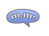 6
6
-- JamesGreen
I like JamesGreen's proposal as it keeps very much the basis for the original sign hold by "the guy". However, I'd suggest trying different colors and sizes in order to see how much his idea works for different formats and purposes. Also, I would definetely remove the 'comma' in between because it 'makes some noise', visually speaking. The rest I feel it is very cool! -- MauricioHernandez 2004-11-29 03:17:25
I agree on the general idea and the suggestion to remove the comma. But also, maybe we can another source because MoinMoin is about dialogue and participation. What follows is a [draft-brute-intial-notbyadesigner] suggestion. -- EM
Dialog Balloon
 7
7
- I think that the idea of two sources is great, but I think a logo should be more that just two letters. The logo should contain moin at least once. My try at this follows. -- JvH
This is the most interesting and original idea - remove the letters and add a MoinMoin text on the side, and its can be really nice. -- NirSoffer 2005-05-24 09:58:35
White Rounded Rectangle Dialog Balloon with Text
 8
8
I like that one. Could somebody make scaled down versions (down to favicon), so we see how it looks like in different sizes? -- ThomasWaldmann 2004-11-30 11:42:24
- I'm glad I didn't do that for nothing. I'll try to make a favicon fast (although in 16x16, I think only a word will fit) , and move the prototype to svg. Makes scaling a lot easier... -- JvH
really nice, but bubble has not enough contrast against white background, perhaps make the border a bit stronger? -- FlorianFesti 2004-11-30 14:38:02
This one lost everything from the Dialog Balloon, will never work with so match text, and the colors are wrong. -- NirSoffer 2005-05-24 09:58:35
Comics Dialog Balloon
Ok, something bolder while I'm at it. Maybe a little too over the top but I like it... (my explaination is below, read after getting your own fresh opinion of it) -- JamesGreen
|
|
|
|
||
I really love this one! Could you make a variant that replaces each M by Moin? -- FlorianFesti 2004-12-03 18:06:31
I like this one a lot. Great job James! ![]() -- EM 2004-11-30 / 15:31.
-- EM 2004-11-30 / 15:31.
My own comments added...what I was going for was keeping the "moin moin!" phrase going in your head, like I think of whenever I see the old logo. The weird lines at the bottom are supposed to be thought bubble lines, although if this gets seriously considered I would rework it to improve it. My inspiration was the "POW!" "BAM!" expressions from old American comics, although just my memory of them as I didn't use any particular source. For very small representations, such as favicon, I would change it to maybe just be one "m", one thought line, just generally try to simplify it while keeping the shape recognizeable. Also, I think the colors work well since you just have a primary color and then a variation on the same color, making it easy to adapt to any other color. -- JamesGreen
This looks really good. I would vote for this immediately, but I think it's too much comic-style, and thus not suitable people who look for something more professional. I'm quite sure, though, that this can be improved by either taking the thought-lines away (as you suggest yourself), or by removing the exclamation mark. I tried to pull it out myself. Being not very good at this, the image is low quality, but it's enough to judge.  I hope James himself can provide us with a better version. -- FabianKreutz 2005-05-24
The problem with this is just too much - too much comics, too much elements, too much noise, too much sources. The concept of a dialog lost completely. -- NirSoffer 2005-05-24 09:58:35
I like a lot of the logos, but what about something like moin2 or m2 instead of using double m or writing moin twice? -- EricDavis
Interesting thought, makes the design easier, but I don't think it keeps with the spirit of the saying, and anyone new to Moin Moin might just think of it as "Moin 2.0" or something. -- JamesGreen
I like this is happening, however, I invite you all to relax just a little and think:
What is MoinMoin about?
- Wikiwikiness
- Communication/Interaction
- Community
- What do the people who made it possible want from Moin?
- What do we want to reflect with Moin?
- How do we want others to see Moin?
- What colors represent the spirit within Moin?
- Do we want simplicity or "in-your-face" for a Logo?
- What are the 3 most important things we want Moin to be kept inside people's minds?
My point is... Don't we need certain minimum parameters to be set before working on Moin logos so that designers, developers, users, etc., can let their imagination flow over common basis? and then we can judge which is the Best logo that will represent EXACTLY what we're looking for.
-- MauricioHernandez 2004-12-01 01:59:17
Good idea, I'll hold off on new suggestions until there is a concensus on these issues. (or there is a concensus not to adhere to these guidelines--whatever, I'm just an artist) -- JamesGreen
"MoinMoin" is a greeting (see MoinMoinEtymology). We should stress this greeting character of the name in our logo. This can by simply done by keeping the exclamation mark. The greeting represents the openness of the WikiWay and invitation to everyone to join.
IMHO there should not be a comma between the two moins. I am not an expert but I think it is simply wrong.
I like the logos that play with the ambiguity of the term "MoinMoin": It can be seen as single greeting and as a dialog between two persons. ("MoinMoin!" or A:"Moin! B:"Moin!")
I like the pop-logo because it is very informal (as our old logo). Wikis are very informal, too. I think to logo should not look too serious.
I also like that it expresses speach/communication and some kind of motion/action which I consider important aspects of wikis.
I also think that the logo should contain the full name not only one or two Ms. Most people will not know MoinMoin and won't understand MM as MoinMoin. As MoinMoin still is a small software projekt we cannot expect people to know our name. It should be part of our logo. Googling for "MoinMoin" leads to our website a logo without the name won't.
-- FlorianFesti 2004-12-01 12:20:21
In my opinon logos are symbolic representations and don't need to have full words in them. So M instead of Moin is just fine for me. -- OliverGraf 2005-05-24 08:38:02
Btw: Use Google image search for "logo" to get some more examples of logos.
I like the Pop logo. What about just adding the full name to it in small print somewhere, perhaps the word Moin nestled in between the 1st and 2nd callouts, and then again between the 2nd and 3rd? Nothing too obvious (perhaps even just a light gray color), but enough to help those who don't know what MM stands for.
The most interesting idea is the double source baloon. The last logo with the three sources balloon lost that idea and is too crowded and its not clear, even in bigger size. It will be unreadable in small size. I think we should check simple name-logo like Plone use.

Moin! should be just fine, either alone or in that two sources balloon. I would not make it too much "comics".
About what MauricioHernandez wrote, MoinMoin is a community tool, a friendly environment for people to share and communicate.
-- NirSoffer 2004-12-02 20:32:13
My 2 cents, to add to the confusion, in small and big (maybe too much) size. BTW, we are using the Modern theme colors, but there is no need. Maybe something warmer will be more like the MoinMoin spirit. -- EduardoMercovich 2004-12-03 17:22:20
Dialog Balloon with Text
 10
10
While I really like the artful draft by JamesGreen I think that you are missing one point. We are talking about two things:
The basic ideas of WikiWiki (community, freedom, ease of use) that are much older and wider than just MoinMoin
Thus I believe that if we insist in having text instead of just a letter, then the text should include some reference to "Wiki".
-- RobertSeeger 2005-01-25 18:29:11
ascii logo
______  ___     _____       ______  ___     _____
___   |/  /________(_)_________   |/  /________(_)______
__  /|_/ /_  __ \_  /__  __ \_  /|_/ /_  __ \_  /__  __ \
_  /  / / / /_/ /  / _  / / /  /  / / / /_/ /  / _  / / /
/_/  /_/  \____//_/  /_/ /_//_/  /_/  \____//_/  /_/ /_/
Parenthesis Moin
I have always thought simple stuff is better than too complicated ones, esp. when talking about image.
I know MoinMoin is the official name, but Moin is already nonsense in Chile and many non-german like countries, therefore I always say to people "Use Moin wiki" because MoinMoin wiki is just too long. I am aware of the similar meanings Moin has for some few countries, but again, as in my country has zero possible meaning, I formaly propose to use "moin" for everyday use.(and continue using MoinMoin for the project name)
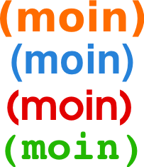
I have no idea about how to use applications such as Gimp or similar, but even if I did, I'd probably get to the same point: Moin inside parenthesis.
Why?
- Because is universal. I can say "Yes, I like wikis very much (esp. moin)" / "My wiki is great (moin)", etc.
- Because I can even imagine a marketing campaign for Moin... "Do you moin?" / "Just moin it and everybody will read it" / "Write it, Share it, Moin it!"
- Because is only plain text, just like the actual way of wikiing... (moin)
Because on a t-shirt it could be like this: [[Include(moin)]] and it would make perfect sense.
Which?
 11
11
For me, I prefer just 1 color (like Kde's current logo) but maybe 2 colors is ok. 3 would be too much! I would go for the light blue (moin) as is similar to current Modern theme.
-- MauricioHernandez 2005-04-27 03:03:27
Retread
I think a lot of people in this discussion don't quite understand what logos, branding, etc. is all about. I dealt with this over three years ago with the last wiki software I deployed widely, where we actually hired a professional identity and branding artist to produce a comprehensive style for our own use and then donated it to the developers, and they're still discussing it, but perhaps the Moin devs will be more reasonable after only just over a year of discussions. ![]()
The current Moin guy is a mascot. It's not a logo. A mascot is like the BSD daemon and Tux the penguin. A logo is like the Apple apple and the Nike swoosh; it's a symbol, an emblem, a graphical mark.
Many of the previous designers I've worked with believe the best logos are just emblems, ones that don't use letters or a stylized rendering of the name in them. It makes it internationally compatible, and it lets you do other things with it, set up an identity independent of the original product or company.
Wikipedia has a very nice article about it: Logo
The crux of the arguments with my previous wiki logo and image design efforts, and the same ones that keep coming up here, is the idea that the logo must convey the "essence of wiki" or "collaboration and sharing and co-authorship and community" and all of that. It's a wonderful notion, but it's wrong.
The Nike swoosh and the silver Apple apple do not convey premier athleticism or fashionable computing. These are the properties we apply to them in our heads based on marketing campaigns and our experiences with the products produced with that mark on them. The marks themselves do not display these properties.
The logo only needs to be a simple, memorable symbol that can stand in for the full name of the product or brand. A conveniently topical article on the Small Business Branding blog sums it up nicely enough for me to duplicate it in its entirety:
Logos Aren't What's Important
People often confuse logos with what's really important - the brand identity (what people think and feel about the company). Whisper Blog uses Ricoh as an excellent example of such confusion. By definition, the logo is merely the brand (i.e. the symbol).
"A logo is not a brand strategy. A logo is instead a graphic symbol of a brand. Nothing more. A logo becomes layered with meaning only after invested with the emotions of the consumer. Understanding how a brand becomes invested with emotion to create market movement is the science of brand strategy." (emphasis mine)
JamesGreen's efforts are probably closest to this concept thus far. I like his original speech bubble much better than his "action packed" revamp. I think two speech bubbles overlapping, the tails combining to make a subtle, stylized "M" would be nice to see, the "M" being very subtle and almost not even there, just like the "hidden" arrow in the FedEx logo.
Alternately, perhaps three line drawings of writing implements, such as a pencil, pen and quill overlapping to make a probably less-subtle "M", the shadows making the second "M." Or perhaps just a stylized line drawing of a pencil would do, perhaps the metal ribbing around the eraser could be a subtle "M." MoinMoin is less about "talking" than, say, forum software would be, so perhaps speech bubbles are not the right conveyance.
I'm not an identity and branding consultant, I'm just throwing these out there, but I have had to deal with this quite a bit.
Either way, the name of the software is "MoinMoin" and if the logo must be a stylized word mark, then it should not be just "Moin," it should be "Moin Moin" or "MoinMoin" or the "MM" abbreviation. That's the name of the software, and to have the mark of trade be anything other than that will only lead to confusion in the wider marketplace. The fact that the word "Moin" has no meaning in most languages is irrelevant: "McDonald's" and "Nike" and "Microsoft" have no meanings either.
Just two cents from someone who's been there.
-- VitoMiliano, April 27, 2005
- Vito, thanks for that excellent input.
I absolutely agree with you. I even tried to motivate one designer I know - PabloPozo - to participate with us because I know such things should be ideally managed by professionals, but so far I still can't motivate him enough. If the name to be used has got to be "MoinMoin", ok.
I had lost focus trying to think about only stuff truly related to "MoinMoin" instead of what we agree we would like it to be. Maybe it would be easier if we all could sit down and discuss about this. -- MauricioHernandez 2005-04-27 15:08:21
MoinMoin bubbles
 12
12
This idea was present before Vito's input, so I just had to place it.
It's about MoinMoin words inside 2 people's dialog bubbles. Bubbles or circles, because all collaboration/community effort I imagine is 'round'. Colors? we could discuss about it, np.
-- MauricioHernandez 2005-04-27 15:29:18
MoinMoin Nodes
 13
13
Moin! greeting, Moin nodes, Moin connected to another Moin, wikiwikiweb
We all have built the MoinMoin community, so here we are...
Another Built Moin
 14
14
-- MauricioHernandez 2005-05-19 05:31:09
M Nodes in a Circle
Entry 15 Final
|
Additional source files:
If you need anything, email me <james DOT green AT ubisoft DOT com>, since I don't check here often.
-- JamesGreen
(old discussion follows)
It ended up looking like the old SGI logo to me, but since it's not really used anymore the likness isn't a big issue I think. I was trying to make something that's simple, graphic, but still has an "M" in it. Works in black and white, scales well in my opinion, and "feels" like something that could be the MoinMoin logo. To me at least.
Please note that I have no vested interest in any particular logo. I've used MoinMoin over the years, and appreciate the work that went into it. I'd like to contribute what I can to the project, and this is one of the few ways I'm able to, so this is why I'm posting stuff. My submissions are based on what I've read here and what people seem to want, or at least my understanding of it. Not an easy thing that's for sure. ![]()
Very nice IMHO! It reminds me somehow at an M and it shows the linkage of MoinMoin's pages. What do the others think? -- AlexanderSchremmer 2005-05-19 18:59:30
Interesting, but too complicated. Will not be clear in small size. Also think I saw this design used by another company - the idea of part of 3d model that form a letter, but I don't remember where. -- NirSoffer 2005-05-19 20:34:13
I think that the logo scales very well and would not have expected anything else. -- AlexanderSchremmer 2005-05-20 14:45:39
Well its still too complicated and does not scale down well. A logo should be much simpler, specially one that needs to be used in very small size. Here is an example of a logo that does scale down well:
 -- NirSoffer 2005-05-22 09:21:27
- James, I like the concept very much. It says about nodes, collaboration, it's round, it's about community, etc. However, could you try with less thick lines? The rounds points are just fine in size, as far as i can tell. Also, could you try with other color than gray, please. Something more alive (orange, red, green) would help noticing better this image from different views. I have to admit that I would have liked to make my idea of "nodes" (two bubbles linked by a line) look much more powerful but I have zero idea of graphic apps. Anyways, I like your idea.
- Why do you think that round is any advantage?
Because, AFAIK, round is about collaboration.
- Why do you think that round is any advantage?
James, what if it were only the m? That is the white nodes. Maybe, that will look more appealing to a scalable image.
I don't really think it works without, although the point about it scaling better is worth trying. I checked, and didn't think it really helped though. (see image) And when larger, it just looks like an "m", the idea of the linked nodes is completely lost. --JamesGreen
I think James' latest tweaks, with the thinner lines and showing different colored backgrounds (but leaving the "M" nodes in white and grey for simplicity) are exactly what makes a good logo:
- It works in black and white as line art. You can stipple or dither the grey parts of the M nodes, or you can outline the white nodes and the circle and just make the grey part black. Perfect for business cards and other things (although obviously that's not quite the concern here).
- It works as vector art, for scaling up to any size necessary (e.g. posters).
- It works at low resolutions. The important bit here is that the "M" nodes are still visible, even if the grey ones aren't perfectly clear. And for favicons, remember that no-one sees the favicon as the first image and impression of a web site. The favicon is a browser-specific nicety to help you remember the site AFTER you've looked at it, in your bookmarks. You only have to recognize what it is AFTER you've seen the large logo at the top of the original page.
It works by itself. It's unique enough that it won't be confused with other projects or products, even SGI, making it possible to develop a unique "MoinMoin" brand.
- It works with different colors. By keeping the "M" nodes centralized in white and grey (whether shaded or not), being able to change the background color makes it flexible for every theme and color combination without additional work.
It's internationally compatible. The "M" is there, but not as the traditional letterform. It's like the FedEx arrow. It's obvious if you know what it is, and it's just a nice emblem if you don't.
- It's easy to give it meaning, which helps with branding. The round outline and the round nodes can be taken to express connections and community and such, but again, that's a meaning YOU give it. It just makes it easier to give.
I think it's great, and should be adopted. --VitoMiliano
I'm sorry but I don't like this last logo:
- Too complicated, does not have one clear concept
- Because of that, does not scale well
- I don't like 3D gimmicks - unless they are really good, like SGI logo. but thats maybe a personal thing (I work in 3d imaging).
In general, I look for a very simple and strong image, one that you can describe with few words. To make this a stronger image, the round background should be removed. Round is not about community - its about roundness. As Vito said, the logo does not have to have all the meanings of a wiki, just a nice image that people will attach the meanings later.
The most interesting idea in this page is the two speakers balloon - with or without any text. Maybe try this direction. If James like to develop this idea, he can make few alternatives without a background, but I'm not sure if this is the direction. I think we should also try the direction of simple name logo. A MoinMoin designed in an interesting way.
-- NirSoffer 2005-05-23 09:47:34
It looks like you have not understand Vito's point - having the word MoinMoin typographically designed will not make it a good logo. He likes it because it resembles an abstract reprensentation of our product not emphasising the actual name (Apple does not print Apple onto its computers either). -- AlexanderSchremmer 2005-05-23 10:07:09
The word MoinMoin does make a perfect Wordmark Logo
Personally I did not like the logo without the exterior circle because it felt to "cold" to me, as it wasn't smooth anymore. Plus, thinking along the lines of nodes, by encasing the entire design in a circle of it's own implies that it is also but one node of a larger collection. (you could make a really cool animated 3 second intro clip using this thought line) --JamesGreen
- Indeed - you could think of seeing the circle as one node of a large fractal.
- James, any chances you could make the links to each node a little less thick, please? Also, IMHO, the more colors we use, the harder it is to handle changes for a logo on diff. mediums. Could you please upload the source file for your current proposals.
Personally, I think that we all fear the same when we face a discussion for our "beloved" project MoinMoin logo. Actually, we're discussing about it shows we do not feel comfortable or represented by current Moin dude, esp. if we think of Marketing Plans, product insertions, etc. Nevertheless, I'd be very glad we could afford paying for a professional someone who can provide the services we need, BUT we can't UNLESS we all agree on donating "money funds". Therefore, if we do not have such money we may then have to consider to pick one of the proposals, otherwise, we will end up waiting "for ever" to be happy with a logo. Or at least, we could vote on current proposals re-vote after 9 months time.
Do we really need to pay for it? Assuming that James and others would not charge, I think that there are many good logos on this page. -- AlexanderSchremmer 2005-05-23 22:02:26
Yes, there are. Then, Can we set some parameters or deadline to start voting for a logo that will represent us for at least 9 months? From my POV we could extend this discussion "eternally".

Indeed. I started the vote

- Perfect! Now:
- How many votes per user? I'd say 2 is ok for the first round. 1 vote for the finals. When will voting finish for 1st round? I'd say 10 days is ok. 5 days for finals.
- One vote is enough. Please delete your second one.
- Ok, I can do that. BUT what if I like 3 proposals?
- One vote is enough. Please delete your second one.
- How many votes per user? I'd say 2 is ok for the first round. 1 vote for the finals. When will voting finish for 1st round? I'd say 10 days is ok. 5 days for finals.
- Perfect! Now:
Moin Cube
|
|
|
16
Resemble the logo 15 idea in povray.
This is much better then 15 if the black will be transparent. The only problem its a nice logo for construction or CAD company, not for a wiki engine. -- NirSoffer 2005-05-24 09:58:35
Dialog Balloon Logo
17

![]()
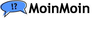
A variation on James dialog balloon, with MoinMoin text. Works in any size.
Pond MoinMoin
18
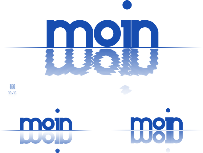
Played around with MoinMoin being a reflection. --JouniAiraksinen
|
|
|
Interesting, but much too big. Please display the images in a typical setup. For site header, the logo should no more then 40-50 pixels. The favicon can work nice but not in that low contrast - it must be clear. Maybe it can have 2 backgrounds colors that create the "reflection". Same favicon can be used in the powered by image.
The interesting concept here is the reflection - and the favicon and the other reflected M show it nicely - there is no need to put double 'moin' in that image, since it can't be the only element in the logo. The name MoinMoin must appear in big readable type, it can't be part of the reflection. That leave the reflected M as the real image near the text.
|
|
I understand the logos presented are big (just to give you idea of details), but size can be anything. Same goes for colors, black and white, blue and white, what suits. Infact it should work as vector too, so size can be from wallsized banner to 16x16 favicon, and eps logo would be black and white anyway and colored to colors needed (as you can see the ice beveled version). --JouniAiraksinen
This version is very good - the colors are just right. Maybe more or less blue background is needed, but the reflection effect is really great. Maybe you like to work on that balloon (#17)? currently its only placed where it should be, but not more than that. -- NirSoffer 2005-05-24 14:55:28
Shared Writing MoinMoin
19
I think the m things alone don't say what we are, round m things look like a common candy around here (if they said S they'd be fruit flavor, M are chocolare), and the cartoon ideas are cute but maybe too cute. I appreciate that they're trying to imply shared messages though. I have a broader concept of a logo that contains two "people" figures each writing moin on some shared material. I had done some art for classroom plans once, so this is only one possible use of that idea:

As it is greyscale currently it can be easily colorized. In the same line of concept, a standing stick-man and a stickperson sitting at a business desk could be corporate, to this one's educational air. Two hands both writing on paper are possible too, but I stopped before having Escher's Hand Drawing Hand draw moin.
Cube M
20

This was started from on the cube idea of James node logo (#15). It can be accepted better then the comics style logos. -- NirSoffer 2005-05-26 00:38:10
Moin upside-down
21
Absolutely "inspired" by the #18 logo proposal. Again, my problem is I know zero about graphics and I know this idea could be very improved by someone with the needed skills. -- MauricioHernandez 2005-05-26 06:58:56
This is not isnpired by #18, it is #18 alternatives, but none of them is better then #18. The reflection idea is not emphasized by using different shape and specially when rotating the image.
Yes, good point. I now changed it to "upside-down". Why? because it is not reflecting as you pointed, and 'moin' is not written, so the whole idea is just that shape. -- MauricioHernandez 2005-05-26 13:46:31
- I'm sorry, but its not upside down, its still only #18 alternatives. Technically this 18 using rotation instead of reflection.
I like how the rotated inverted -whatever- "m" resembles a "w". So we have MoinMoin and WikiWiki. Besides, it looks like more balanced than #18. I like it!
By the way, my idea was to use the "Ubuntu" logo font but I could not get it, and I hope you can picture it. -- MauricioHernandez 2005-05-28 04:17:26
- We can't, and its not clear why this style is good in this case.
I really don't like the hostile intent of the unsigned negative comments here. I quite like these logos, even if they are "just alternatives to #18". If colour is an issue for some people, perhaps the logo could be adapted for some of the more popular themes. -- JasonStirling 2005-09-18 00:39:46
Moin Kite
22
Well, again, kite but in "ubuntu's" m's. -- MauricioHernandez 2005-06-06 23:52:30 Does this look better?
This is a more ideal version, IMHO, a clearer idea of what I want or look for. Please improve it if you like it. -- MauricioHernandez 2005-05-29 05:01:32
- This is a new idea. Its not clear why the lower m has different color.
AFAIK, a logo can be anything, as long as WE make it have a concept (does the apple mean anything to you?). As for the colors, my monitor colors suck, however; I thought grey and blue were ok as you-developers decided 'modern' was the so-far-official theme. Also, the two m is basically because I've heard many times here that we should use MoinMoin instead of Moin, therfore, m and m upside-down. Also, upside-down because no matter if you are in the other side of the planet, you can still contribute. Now, I am not looking for difficult concepts in any of my proposals. On the contrary, just cooperation, moinmoin, inside a community or node. I appreciate your feedback very much but if you like any idea, please feel free to propose your improvements because you know I know nothing about graphics and you do. -- MauricioHernandez 2005-05-29 17:22:33
If it were my decission, i'd go with this in black and orange
Moin Ninja
23
A similar concept to one of the above ![]() -- MauricioHernandez 2005-05-29 05:01:32
-- MauricioHernandez 2005-05-29 05:01:32
- Here you have new concept, the reflection (upside down as you call it) does not belong here.
I agree, but then, no M and M? -- MauricioHernandez 2005-05-29 17:22:33
Moin Tu
24
Well, this is the closest to what a MoinMoin logo would make me happy ![]() Again, feel free to improve it if you like it and provide feedback. Oh, and please VOTE for IT!
Again, feel free to improve it if you like it and provide feedback. Oh, and please VOTE for IT! ![]() -- MauricioHernandez 2005-05-30 05:35:22
-- MauricioHernandez 2005-05-30 05:35:22
General discussion
I am still undecided between 1, 9 and 15.
1 is not a logo, but it is our known mascot and has a direct, written connection to MoinMoin.
9 is very nice, but may be a too funny comic style for corporate use (might make people thinking MoinMoin is some fun software, not to be taken for serious applications). It shows how ideas of multiple people go together.
15 (or an improvement of it) is maybe better for corporate use, but no connection to MoinMoin. For CS people, it shows some connected nodes, but for most people it will rather look like a CAD logo.
-- ThomasWaldmann 2005-06-05 15:47:31
The connection will evolve of course. IMHO it does not look like a CAD logo, especially because it is neither perspectively correct nor does it use shadows. -- AlexanderSchremmer 2005-06-05 15:51:49
If 1 is not a logo, 9 too funny for the project and 15 looks like (bad) CAD logo, then vote for others. Anyway, I don't think we should choose any of the options here, but think in which direction are we going. You can see only few directions here, most of the offers are alternatives on other logos. -- NirSoffer 2005-06-05 16:11:43
Vote
Many suggestions, many opinions, many nice logos. But which one looks good to you? The community voted.
- Two votes by 147.175.167.8 were removed.
- One anonymous vote originating at the Forschungszentrum Jülich was removed.
- The responsible person already apologised.
- Removed an anonymous vote from Netia, Poland.
None of the alternative here is final. The purpose of the vote is to see what direction is preferred by most users of this wiki. The vote will be closed when the rate of votes decayed to the necessary extent.
The vote was closed at 2005-06-08 18:00:00. Please do not vote anymore.
So it looks like 15, 9 and 22 were the most favored ones. Logo creators, esp. the winner no. 15, please try to supply the logo files in the sizes described by Nir above.
 We still need at least favicon of that logo, maybe also some other colours better matching the non-modern themes.
 This is the project logo - there should be only one logo using one set of colors. Try to find one company that use its logo in multiple colors as a user preferences. The logo and the favicon should not be included in distribution, wiki owners should use their own site logo and favicon. We need a favicon for this logo, but unfortunately this design does not scale well to a favicon. -- NirSoffer 2005-10-24 01:59:44
OK, here's my (late) vote:
- I like 18 a lot, but not the one with the waves (too playful), but the simple blue one. very scaleable, too. (pondmoimoinicons.gif)
- 21 + 22 are quite similar and ok, too.
15 is surely nice and one of the best more complex ones, but if you're visually impaired, you favour a) simple designs and b) clear contrast & bright colours.
- 18 + 21 have the advantage of most probably working on any background (esp. black AND white); if you keep the white in 22, it'll look bad on black; if you make it transparent, it might look bad.
-- JürgenHermann 2005-07-25 09:37:53



 1
1 


 5
5  9
9 