New user interface design using facets browsing/filtering
See FacetedClassificationInMoin, FacetsEngine, PagesHierarchy for background and FacetMap for another UI proposal.
Contents
Design principles
- Keep good old familiar items when possible
- Consistent layout between different wikis - system, wiki and user pages will be located at the same place
- The wiki structure will be displayed automatically
System pages
System page are different from specific wiki pages:
- They are well refined by many people over few years
- They are static in nature - they change only when the system changes
- The structure is clear
- They might be shared by several wikis as immutable resource - wiki administrator sweet dream
- They might change on each system upgrade
- Every wiki has those pages
Main System pages:
FindPage - starting point for every kind of search/index - see http://nirs.dyndns.org/nirs/NewFindPage
HelpContents - starting point for all help questions
Wiki specific pages
Wiki specific pages are a big mess:
- The structure of those pages is unclear or non existent, or itself "under construction"
- Most pages in a state of "under construction"
- They are the most important pages in the wiki
- Its hard to create an up to date road map of these pages
- They don't change when you upgrade the system
Using facet to classify those page is the simples thing for the users and administrator. Using the bottom up way, we can have an up to date view of the wiki at all times.
User pages
Users have 2 important pages:
- Preferences
- Home page
And some might want to use these, although browses already handle them:
- Bookmarks - pages you want to have quick access
- History - what we call page trail today
Layout
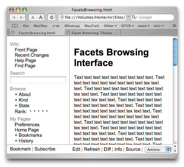
This is first sketch:

Do play with the test page at http://nirs.dyndns.org/~nir/FacetsBrowsing.html or download: FacetsBrowsing.tar.bz2
Comments about the design:
- On the left - the wiki control - main pages, search, browse, user space
- On the right - the content
(On RTL wikis this will be reversed)
- On the bottom - toolbars. The top of the window is allready cluttered with various browser tool bars, and the bottom of the view contains usually only status bar.
- On the bottom left - edit the wiki control, the only part editable is the user space.
- On the bottom right - edit the content. The most used functions right there, esoteric functions (rename, delete etc.) in a pop-up menu.
- There is little "decoration" at the current state - I want to investigate the browsing interface.
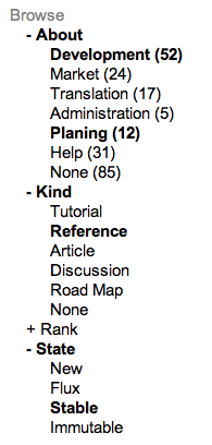
- Note that when you select a facet value - the facet and value are rendered in bold. In this way, you can see very easily what browsing options are active in one look. We can use also different color or background color for this.

- The current rating interface is RTL - LTR one should be reversed, so the empty space after the word "Rank" and before the first dot clear all the dots, instead of the space in the right side of the dots.
Typical user tasks
This is a description of typical user tasks. Complex description and many clicks (M$ Windows style) means bad interface. Simple description and few clicks means easy to use interface.
Checking whats new: RecentChanges
Click on RecentChanges
Browsing for help on formating text
- Click on Help
Select the HelpOnFormatting from the familiar well organized HelpPage (today this page is buried under HelpOnEditing)
Browsing an esoteric help page: HelpOnXmlPages
- Click on Help
Click /AdvancedTopics
Select HelpOnXmlPages
Learning about ways to find options
- Click on Find
- Use advanced search or choose one of the many indexes
Browsing wiki specific pages: high ranked market pages
- Click on About if its collapsed
Click on MoinMarket
- The browse interface opens in the content area, listing all the pages marked with that topic
Narrow the search by selecting *** from the Rank menu
- Narrow the search even more by selecting another facet value
Click on the page link, like ThemeMarket
Searching for pages or text
We can mix facet and search - let the facet selection filter the search results, just like they filter the browser results. We can think of it as browse in the search results, or search in the browser. I don't really know how it is going to work, but it seems great feature for the user. Imagine you could do this in Google search results.
- Enter search terms in the search box and click enter
- Narrow the search results by selecting values from facets on the side bar
- Click on a page link
Problems
This is the hard part in this design. Some issues to solve:
How to add and remove terms from a facet?
- Clicking on links to add a term - the easiest way - one click to add a term, one click to remove.
- Making the terms links can confuse the user, because they look like regular pages links, which they are not.
- Checking a checkbox to add or remove a term - user will understand this easily
- Selecting from menu with multiple select - clumsy, but if we have more then 10-15 terms in a facet, it will be too long to fit in a side bar.
Multiple term selection or single selection
- Some facets needs multiply selection, like About. A page can be about more then one topic. We do not want a very long list of topics, but a short list that gives you the impression of what is wiki is about.
- Rank facets needs single selection - a page will have one rank.
This can be implemented in one line, see how ranking is done here: http://nirs.freeshell.org/forum/forum.html
- If we add When facet, we can add menu selection to select Last day, Last Week, Last month, Last Year etc.
How to reset the browsing/filtering?
The layout contains an [X] button at the top of the browse/filter bar. When you click on it, all terms are deselected.
Mixing browsing and indexing schemes
We can use the facet to browse in every view of the wiki.
- Search results - narrow too many results by selecting a term
RecentChanges - see recent changes in the Market pages
The biggest problem with mixing is confusion: a use might look at a filtered view and think it is a complete view. If we don't design it properly, this can harm SoftSecurity of the wiki.
A possible solution might use different color for the content view when you use filtering/browsing. Like white background for full view, and light yellow or light blue for a filtered view. This with the same color used in the browse bar, can solve this problem.
Maybe we need also to changed the titled for a filtered view, like: Recent Changes (Partial View)
Huge wikis
Can we use this design for wikipedia? This kind of wiki might have 50-100 terms in its About facet.
What if the wiki has 20 facets? too much to fit in a side bar.
Although most wikis are not about "Everything", we need a design that can scale.
How to show pages lists
- How many pages we show when you select a term, and in what order?
- Can we sort the page list in another way?
- Show some context form each page - a description? the first 2 lines?
Show meta data for pages? - like we do in RecentChanges?
How can we add this to the classic theme?
We can choose two options:
- Keep the classic theme, and find a way to add facet browsing, maybe a link "Browse" that will open the browser interface with facets menus/lists at the side/top.
Move to side bar theme, like MediaWiki.
We don't have to support 10 themes, we can publish one good theme and let other people write and share their own themes using ThemeMarket.
How to mark pages with facet values
Setting values should be easy, or people will never do it, and the browser interface will not help anybody.
- Select from a menu?
- Write using special markup?
- Both?
- Use the browser bar to set values? this might be the best option for setting values, but again a source for confusion - will it start a browser when clicked or just set a facet value?
- We can use the browser bar for setting values when you in edit mode, and as browser when you are in browse mode. Still seems a useability problem.
How to define facets and values?
Adding or deleting new values should be easy, but an explicit operation.
Check http://www.kimbly.com/cgi-bin/diamond - in this wiki, the list of facets is updated automatically when you add a new value in page meta data. This totally wrong. Defining facets is a delicate job and should be done with a lot of thought, not by spelling error or careless user (or a spam robot).
Creating too many needless values will make working with the menus/lists practically impossible, you will always have to scroll to find something.
I feel it should be as easy and free as today is adding/changing Category*. That is, a link with a WikiWord should be enough, even if it can add a page to a facet just because a link to that facet is present in the content. If we don't trust this to the wiki community, we shouldn't trust also to edit the content.
 -- EduardoMercovich.
We can set all the facets values in one wiki pages called MoinFacets, using a simple list:
Add or remove from the list to add facets and values:
 * About
  * Development
  * Market
  ...
 * Kind
  * ...
Then we can let the use add facets and values with a menu or by hand, or both.
Discussion
(Moved from FacetedClassificationInMoin)
It would be very good to be able to filter the search to only certain wikispaces (facets or pairs of facets/value). However, we should be very careful of mixing search and tree-like access.
Users asume that usually a tree is something fixed. If we use it as a filter they could wipe out of their view a great deal of the wiki without knowing.
However, this doesn't apply to the search specific page. In that particular place users will understand that facets are working as filters, specially since the facets will be shown/used with another user interface widget that will not resemble a tree.
Which specific widget, depends on the relation between power and simplicity that we want.
- SELECT element in HTML (popup menus in Mac or comboboxes in Windows (In linux?) are good to make one choice (and not more) over a few ones.
- If the list is long, radio buttons could be best, since they show the list of options.
- If more than one choice is wanted, maybe checkboxes could do it.
-- EduardoMercovich.
I've found a very simple script that uses CSS to colapse/expand, see it http://gaiasur.inspiro.com.ar
I have my own (even simpler) scripts for outline views, without using ids for each list - check the attached html file. -- NirSoffer 2004-07-08 16:30:37
why the user part is last? althought this could be fine tuned with Themes
I think it make sense: go from top to bottom - general wiki part -> this wiki part -> this user part. But of course one can design a different theme.
