Author Notes
Future warning
Try to avoid using d['page_home_page'] for your themes. It isn't used by theme base class, but it is still available in 1.3.4, but won't be available in some future release (due in May/June 2005).
We had to remove that because of a new interwiki feature. In that release, there will be some d['home_page'] variable containing a (homewiki,homepage) tuple (this tuple is new and not available in current releases).
If you just call the base class function to render the user / userpref links, you won't have any trouble anyway.
Fixing pre 1.3.3 themes
On 1.3.3, the stylesheets variables changed. In the new code, you don't need them on new themes, so its little easier to create new themes. To make pre-1.3.3 theme work on 1.3.3, just remove those variables. To make it clear, here is a typical patch: 1.3.3.patch .
Sorry for the inconvenience, -- NirSoffer 2005-03-08 19:04:45
Migrating 1.2 themes to 1.3
This is not easy - 1.2 theme code was the first version of the theme package, and was heavily changed in 1.3, and it is much more complete now. The best way is to rewrite your theme using new 1.3 code. This should be much easier to create new theme now, usually only CSS changes will be enough. If you need more then CSS changes, look in included themes modules, and check theme.init.py to see what methods you can use or override in your theme.
Discussion
Theme Accessibility
Are there any themes available that have been designed with accessibility for the vision-impaired/blind in mind? By this, I mean making it easy to skip the navigation links (possibly with a keyboard shortcut) and using CSS2 (which a lot of the themes do anyway) instead of tables. Also, making sure that all the images have alt tags is a must.
Essentially, a theme is quite likely to be accessible if the ordering of the HTML is something like: title, navigation links, content. The order of the DIVs in the HTML is what a screen reader (program that conversts the screen to speech) would read and is the most natural way to read a page.
I have found Wikis -- and MoinMoin in particular -- to be very accessible. Moin now runs my entire web site, which relates to an Open Source project making accessible games. I created a slight modification of the default theme to increase its accessibility. You can see what I had to change (not much, really) here: http://www.agrip.org.uk/
I'd love to move to some of the more modern themes, like the sidebar ones, but have found them to be less accessible than the default one. It took quite a while to get the CSS2 working for my theme (mainly because of IE -- grrr) and currently I don't have time to go through that again so I'm kind of stuck.
I thought it might be a good idea to promote accessibility here because Moin is such a great Wiki and has a focus on being usable by a wide audience. As an example of a benefit it could bring to the Moin community, testing themes for accessibility could mean that large companies who are bound by the law to cater for employees may consider Moin over other Wikis if they are to deploy one.
Keep up the good work -- I'm looking forward to 1.3!
-- http://www.agrip.org.uk/MatthewAtkinson
This likely isn't the best page for this this discussion. Oh well.
Keep in mind that there is more to accessibility than link placement. I help run a support site with a high number of users who have color sensitivity issues related to autistic spectrum disorders. It's just as important to provide high and very low contrast themes as it is to provide for easy navigation by screen readers. I'm working on a couple themes for this purpose right now, taking the steel skin and making it even dimmer. If there is interest in a moin accesibility project of some kind I'll gladly contribute what I've come up with.
- -- Velvet Elvis
Challenges For The Python-Ignorant
It would be nice if MoinMoin provided a way to completely change the look of the Wiki without the need to know the Python language (other than simply changing the stylesheet, which isn't good enough!). ![]()
- I don't know Python, but it was a snap to change the theme. First, changing the stylesheet you can do almost anything. In case what you want needs extra -or different- code, clone the closest theme. Then edit your Moin/themes/yourthemenamehere.py. First, look for the places where the definitions are printed and add your divs as desired. If required, change the definitions (look for examples on other themes). Then, you only have to touch the css.
Additionally, Python was designed as a language for the Python-ignorant ![]() No, seriously, when you look at Python code, it's very hard not to understand it.
No, seriously, when you look at Python code, it's very hard not to understand it.
- . And I fall into this trap all the time. _ANY_ programming language looks like gibberish to people who have no programming experience.
Well, you need some kind of way of specifying how things are going to look, and whatever way you do it it is going to be at least as complex as the problem you are trying to solve. It's like complaining that writing is too difficult because you have to learn all the letters and that one should create a simpler writing language - but then how many ideas would one be able to express? Making templates is not for everybody, and if one is not able to pick up Python within an hour then better leave it be. Granted, one could start with something easier - a template language of some sorts. Then a) you still have to learn a language, and b) now everybody needs to learn that language even if they already know Python. Then half a year goes and somebody needs to extend the template language in order to do what they want, and suddenly that simple template language have turned into a full-fledged programming language that's just as difficult to wield, except now it is propriotary and has taken a lot of work to build. Better just leave it...
small pages
I suggest we rather split this page on many subpages and only present small thumbnails on this page. Then the screenshots on every sub page could be a bit bigger. I think we could manage this with the ImageLink macro.
moin heading difficulties
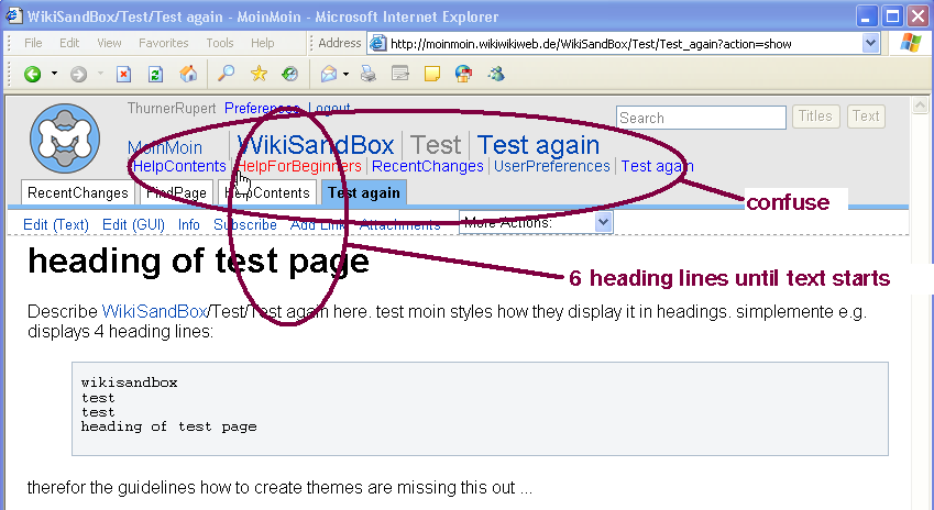
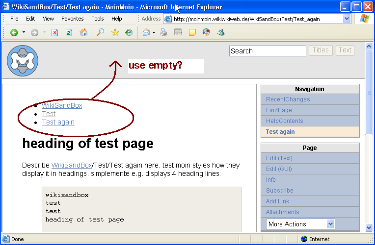
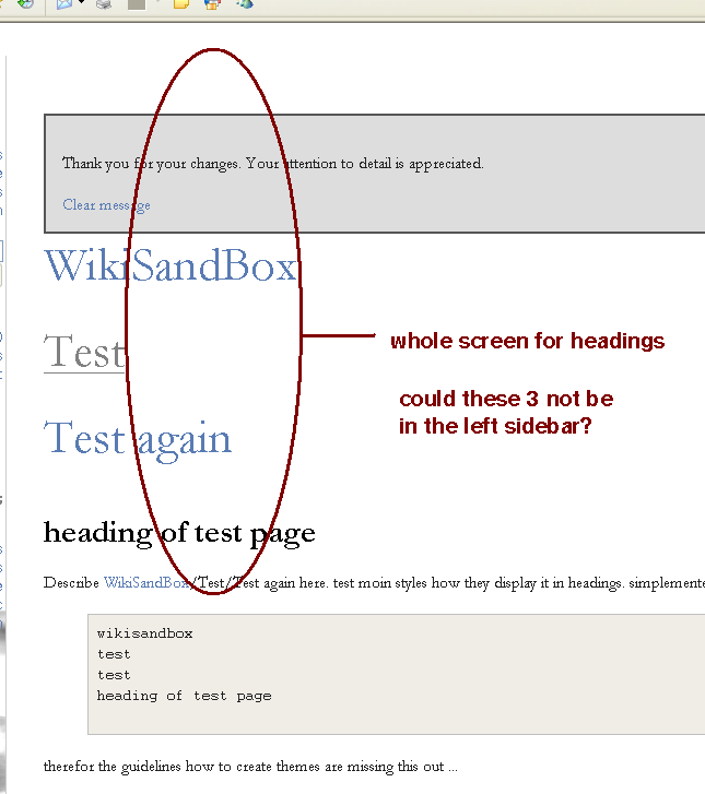
there seems no clear guideline on how headings should be treated in moin which leads to messy / space wasting displays, see the following examples:
modern

right smaller

simplemente

Hmm may be you should have a look into these themes with a browser which does well use css too. Currently your browser seems to miss some signs. e.g. / (!WikiSandBox/Test/Test_again) If a place holder of | is used for every sign it does not be able to show its really confusing -- ReimarBauer 2007-07-18 11:01:36
tried with firefox-2, and ie-6 ... and i'm unable to grasp your point?
mine looks like this

I do agree to the space wasting in the themes that could be improved, see WeNeedHelp.
a hint/rule how to write themes. something like:
- the page contains the top header, so do not put the pagename as header
- subpages are displayed small either in a row (top, bottom themes), or in a list (leftside, rightside themes)
this then means also change pages like RecentChanges.
or do it the other way round:
- the page does not contain a top header but maybe a "pretty print top header" in the metadata
- the theme must display the page name or the metadata alternative page name prominently
this then means pages like FrontPage need to be changed
the main problem is that some themes put the page name as header and others do not. and the contents is therefor a mess as well. some have a top header, some do not. so i am unsure, should i change frontpage, or recentchanges?
backward search without pagename in header?
I personalized my wiki using and adapting the mentalwealth theme. As the pagename does no longer appear in the wiki header, its backward search function (show links to this page) is not available. Is there any alternative method to include this functionality (e.g. moinmoin action to be included in sidebar)?
