Moniker Theme
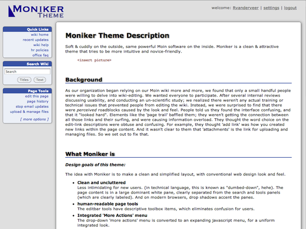
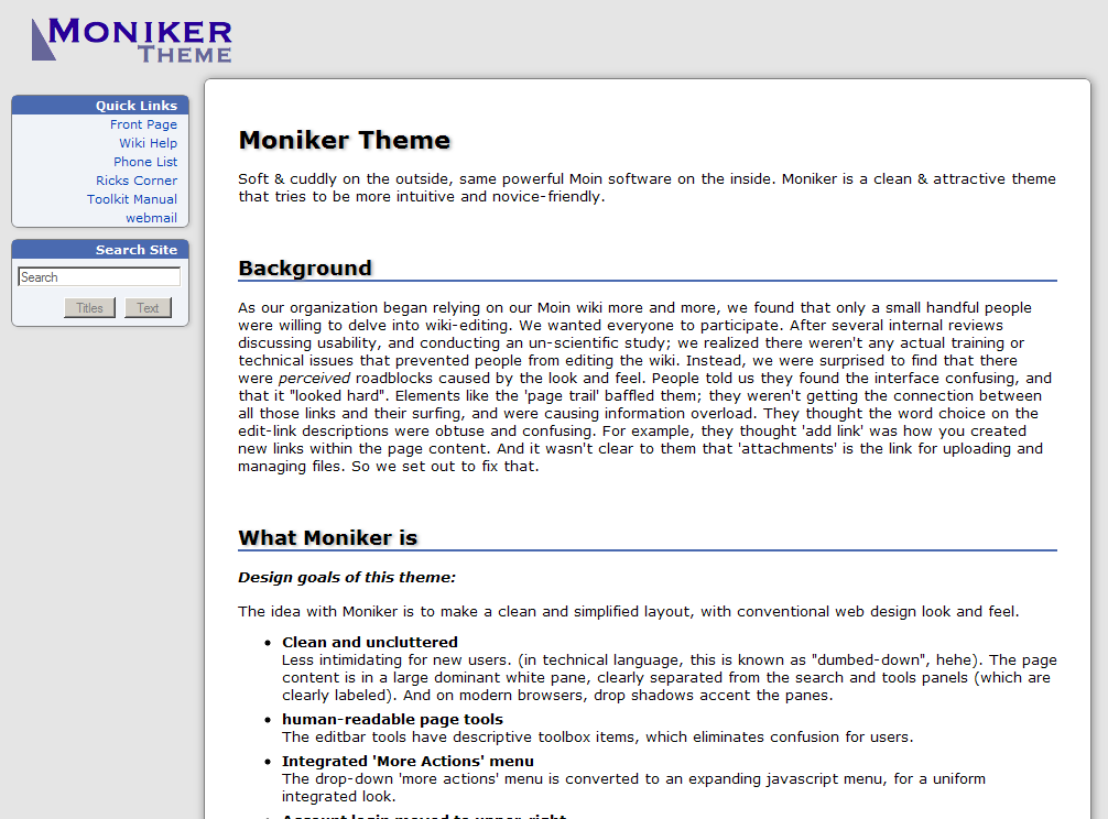
Soft & cuddly on the outside, same powerful Moin software on the inside. Moniker is a clean & attractive theme that tries to be more intuitive and novice-friendly.
Author: RickVanderveer
Background
As our organization began relying on our Moin wiki more and more, we found that only a small handful people were willing to delve into wiki-editing. We wanted everyone to participate. After several internal reviews discussing usability, and conducting an un-scientific study; we realized there weren't any actual training or technical issues that prevented people from editing the wiki. Instead, we were surprised to find that there were perceived roadblocks caused by the look and feel. People told us they found the interface confusing, and that it "looked hard". Elements like the 'page trail' baffled them; they weren't getting the connection between all those links and their surfing, and were causing information overload. They thought the word choice on the edit-link descriptions were obtuse and confusing. For example, they thought 'add link' was how you created new links within the page content. And it wasn't clear to them that 'attachments' is the link for uploading and managing files. So we set out to fix that.
What Moniker is
Design goals of this theme:
The idea with Moniker is to make a clean and simplified layout, with conventional web design look and feel.
Clean and uncluttered
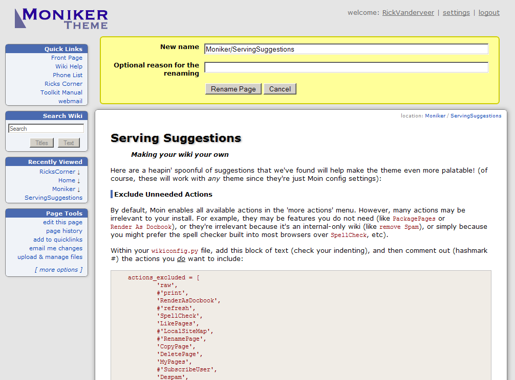
Less intimidating for new users. (in technical language, this is known as "dumbed-down", hehe). The page content is in a large dominant white pane, clearly separated from the search and tools panels (which are clearly labeled). And on modern browsers, drop shadows accent the panes.human-readable page tools
The editbar tools have descriptive toolbox items, which eliminates confusion for users.Integrated 'More Actions' menu
The drop-down 'more actions' menu is converted to an expanding javascript menu, for a uniform integrated look.Account login moved to upper-right
This follows the convention of where most websites put their login information (for example: Yahoo, Google, Netflix, your bank, etc).
What's missing (and why)?
With our goal of streamlining and making things easier, we strip out a few Moin features. Here's what you should know:
Where's page trail?
Update: by popular demand, I've added in a page trail in Moniker-2.1. There is now an additional "Recently Viewed" pane.
We eliminated 'page trail' because our theme automatically leverages functionality already built into your browser: the forward & back buttons and the history menu. Our users told us that these links were confusing, and that they crowded the webpage and were largely unnecessary (i.e. they didn't use them anyway, instead simply using the back button when necessary). If you miss it, you can easily add it in with a well-placed self.trail(d) statement.Where am I?
Update: by popular demand, I've added in Page Location in Moniker-2.1. This is now listed discretely in the upper-right corner of the content area.
(i.e. there's no 'Current Page' link). This theme removes this link for two reasons:the URL-based page-name shouldn't define what you want the page-title to be. For example, the URL-based name of this page is ThemeMarket/Moniker, but I want the page to read = Moniker Theme Description =. Every page should have its own = Page Title =.
- and, it simply doesn't make sense for a page to have a link to itself.
To gain back the linkto: search functionality that the Modernized theme offers, you should install the LinksToThisPage action, which will then appear in the 'more actions' menu. (P.S. you can also rename this macro as What Links Here.py and it still works perfectly, spaces and all).
Not all browsers are created equal
Moniker uses modern CSS3-specific standards for decorations like drop shadows and rounded corners, which help make elements pop. On modern browsers like Firefox, Safari, and Chrome Moniker looks pretty darn good (if I do say so myself). Moniker works perfectly in Internet Explorer, but with boring square corners and no shadows. We decided not to complicate the CSS or make the page unduly heavy by adding shadow-graphics to achieve the same effects for a browser that cannot leverage modern standards. If your users insist on a backwards browser, they'll have to suffer the consequences.
What's with the name?
I hate thinking up names, so I came up with a name that means "name" (heh!). I'm not much of a graphic artist either, that logo is a placeholder for your own company or organizations logo (cheesy logo not included).
Download
Tested extensively on Firefox, IE 7 & 8, Chrome, and Safari 4. IE 6 should work (believe it or not), but is less tested (IE6 users: your browser is six years old, it's time to upgrade!).
download moniker18_2.1.1.zip - for Moin 1.8 (and possibly earlier)
download moniker19-2.1.1.zip - for Moin 1.9
If you use this theme, please drop me a note!
Configuration Suggestions & Miscellaneous
Some configuration suggestions and add-ons that will help make your wiki even friendlier.


